The brief
UltraPlayer is an IPTV player for streaming live TV and video. In a crowded category of look-alike apps, it needed a mark that is recognisable at the size of an app icon, and a small, clear system to carry it across the web and social media.
What we did
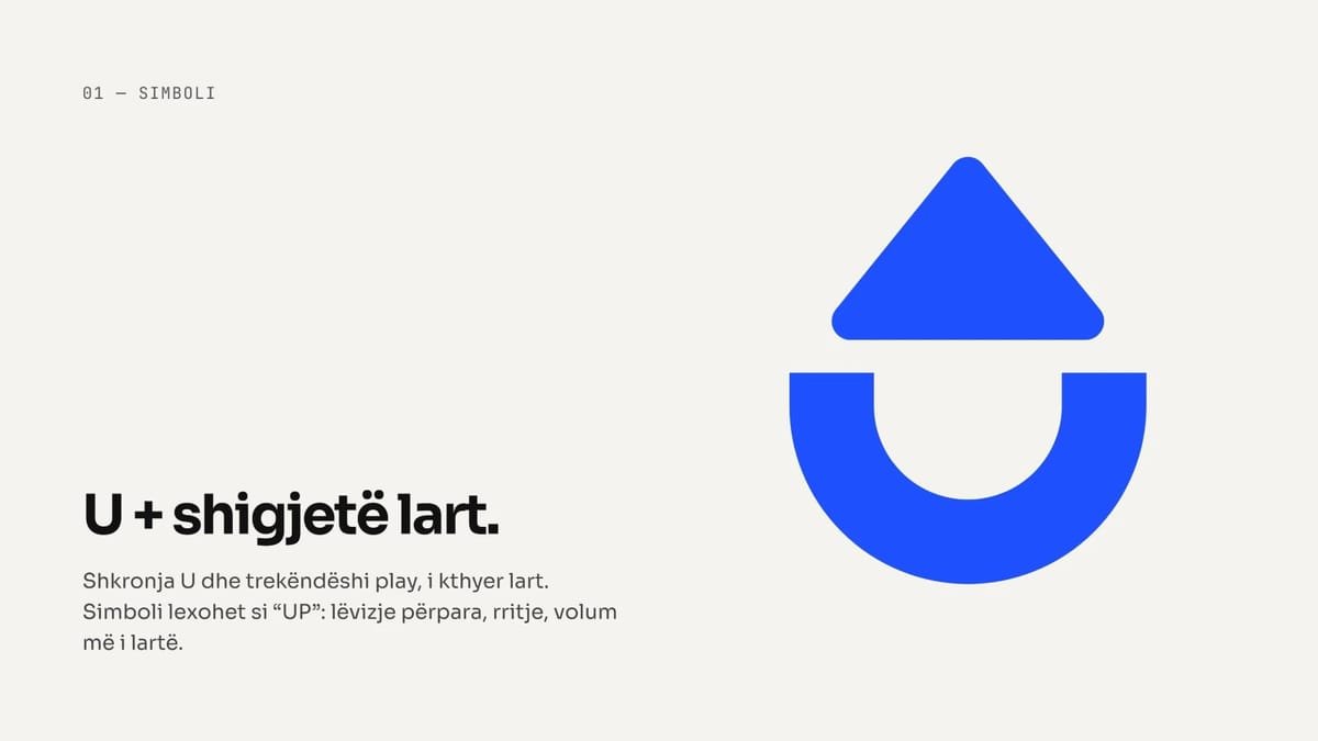
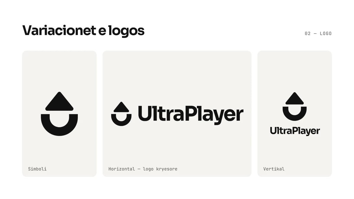
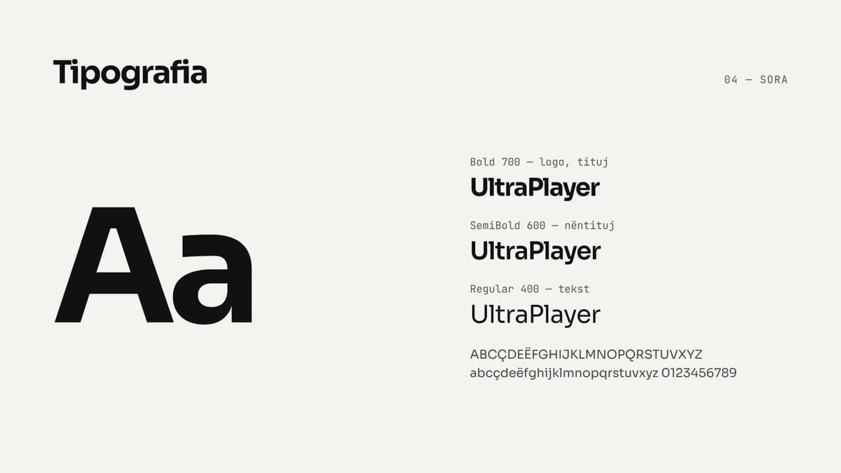
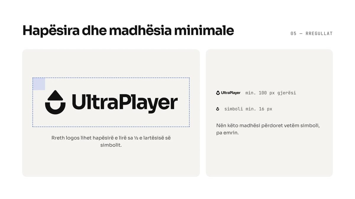
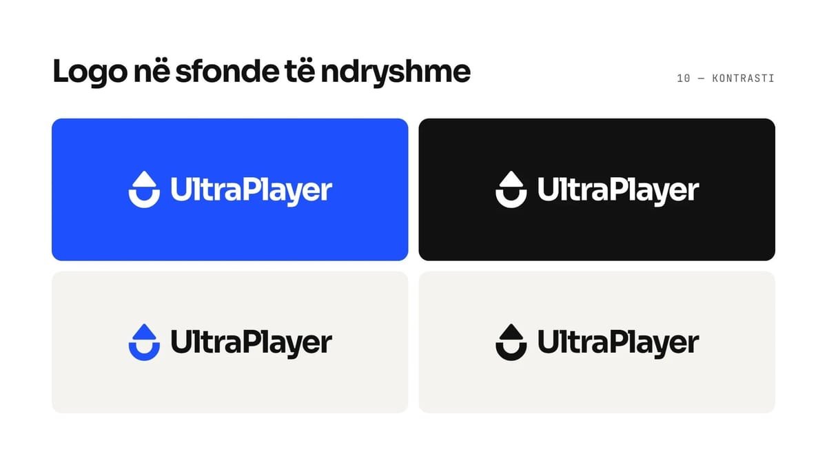
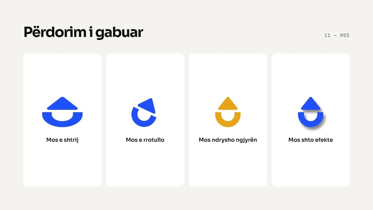
The symbol joins two ideas: the letter U and the play triangle, turned to point upwards. Together they read as “UP”: moving forward, growth, the volume going up. The wordmark is set in Sora Bold, tight and confident, and the logo comes in three versions: the symbol on its own, the horizontal primary logo and a stacked vertical one.
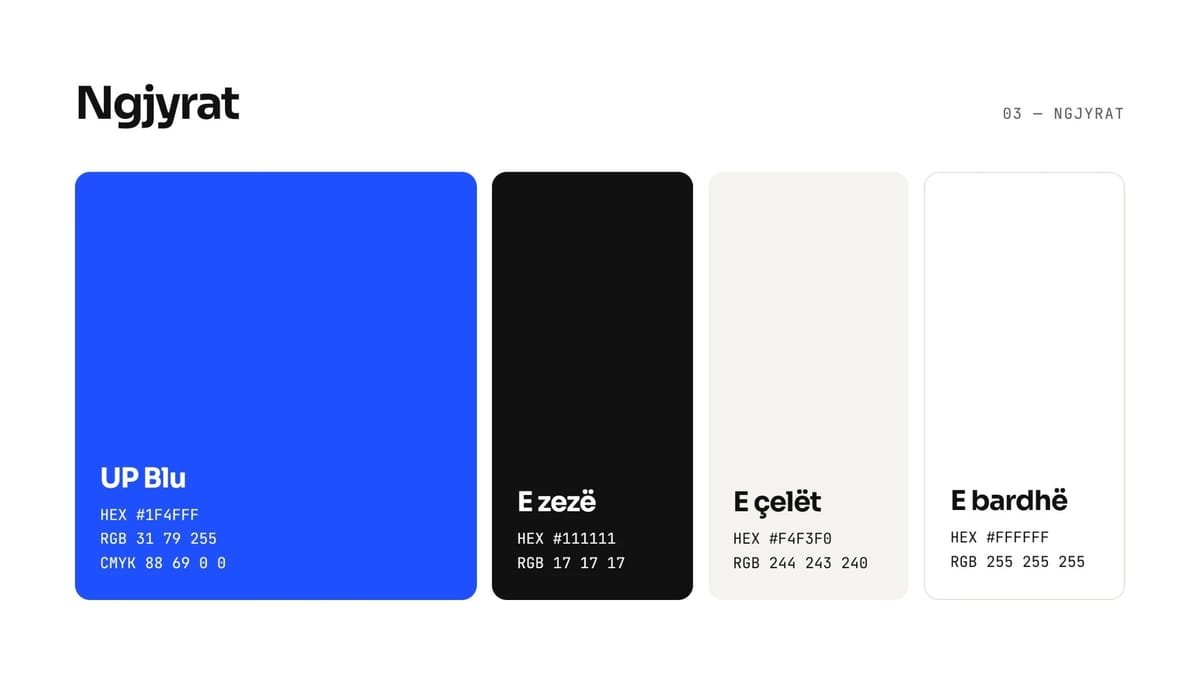
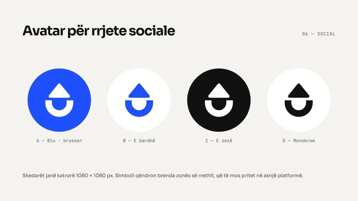
The palette is deliberately short: UP Blue (#1F4FFF) as the signature, with black, an off-white and white. Sora carries all the type, from Bold for the logo and headlines to SemiBold for subheadings and Regular for text. Everything is collected in a guide to the logo and its use on the web and social media.
The result
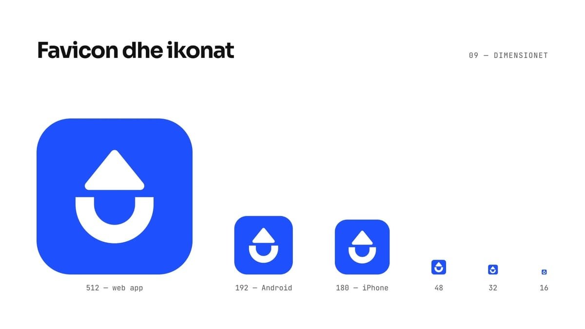
A brand that fits in one shape and one colour, and holds up from a favicon to a full-screen splash.