The brief
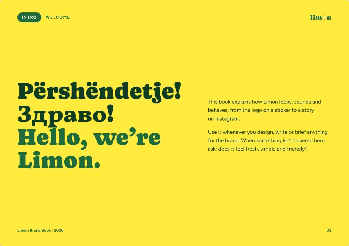
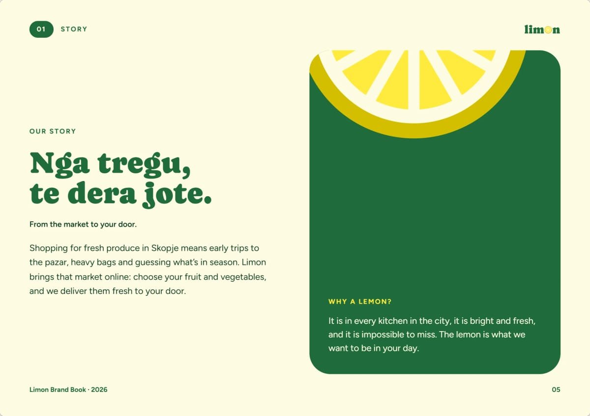
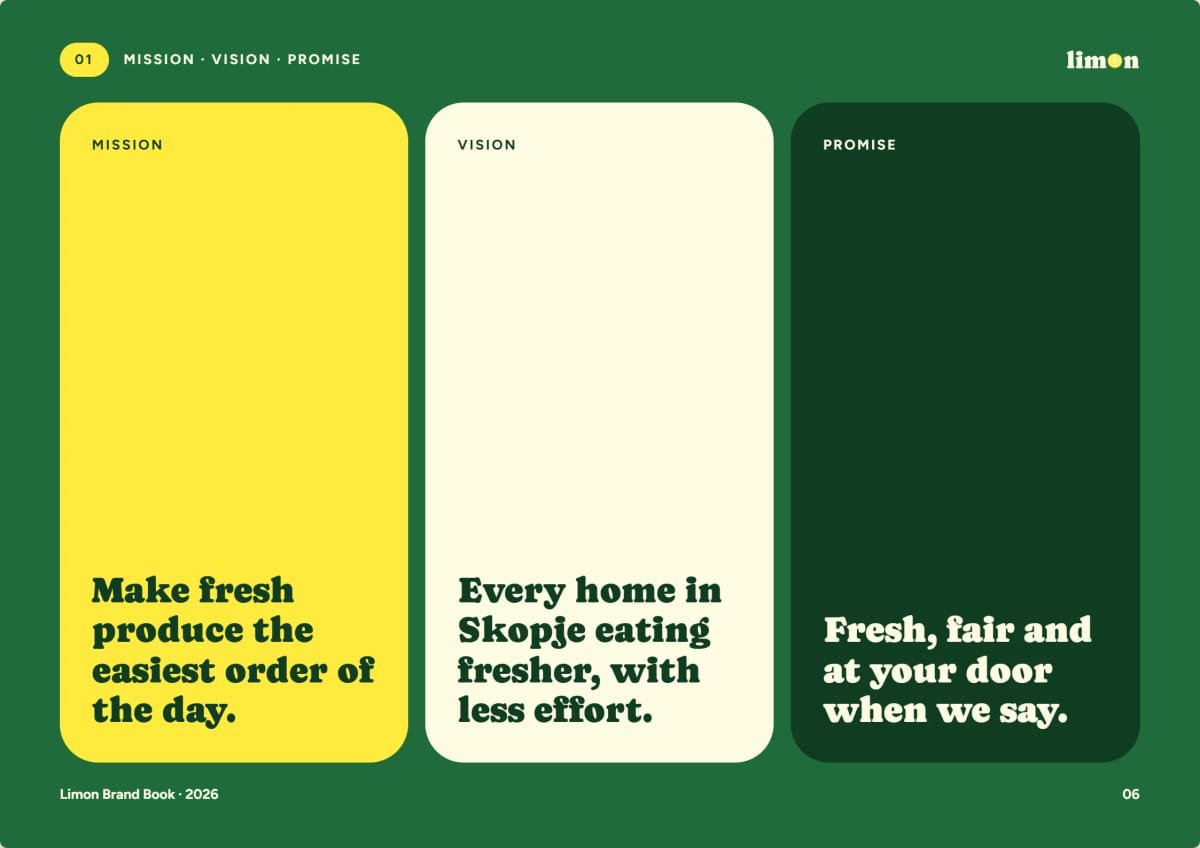
Limon is a grocery store and online grocery store in Skopje. Shopping for fresh produce in the city still means early trips to the pazar, heavy bags and guessing what’s in season; Limon brings that market online and delivers it to the door. They needed a brand that feels as fresh as the produce, speaks Albanian and Macedonian like a neighbour, and works just as well on a shop front as on a phone screen.
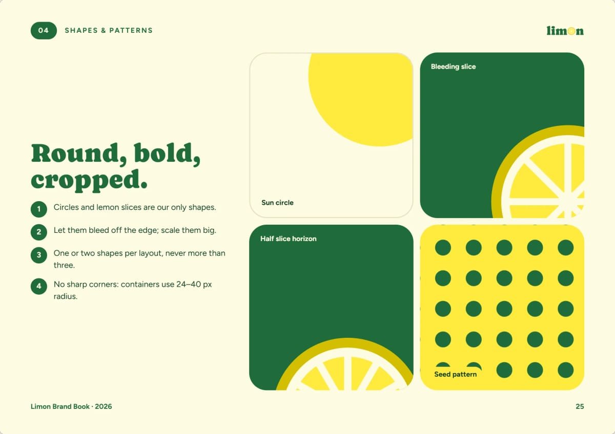
What we did
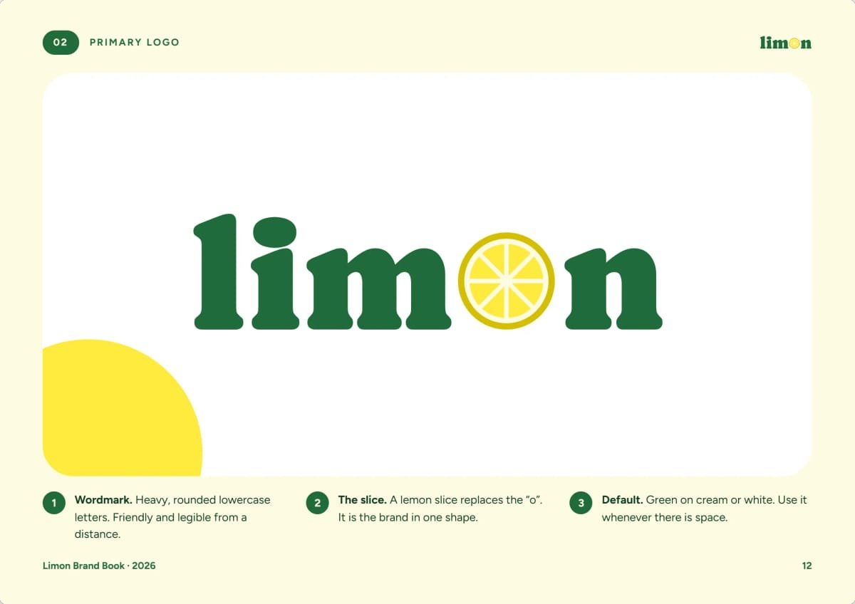
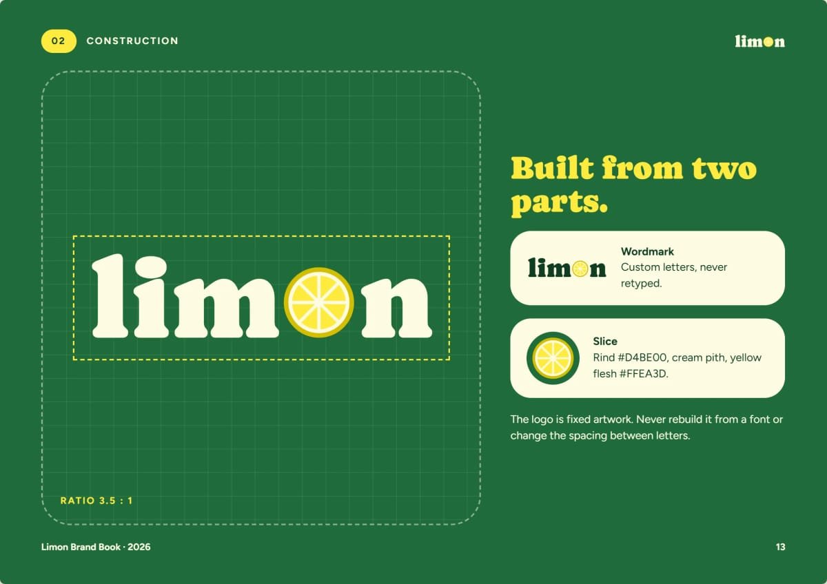
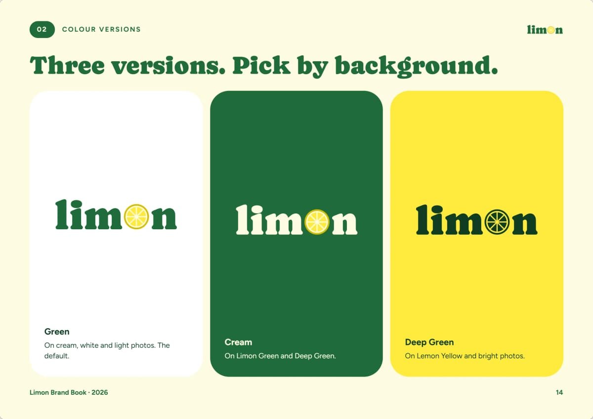
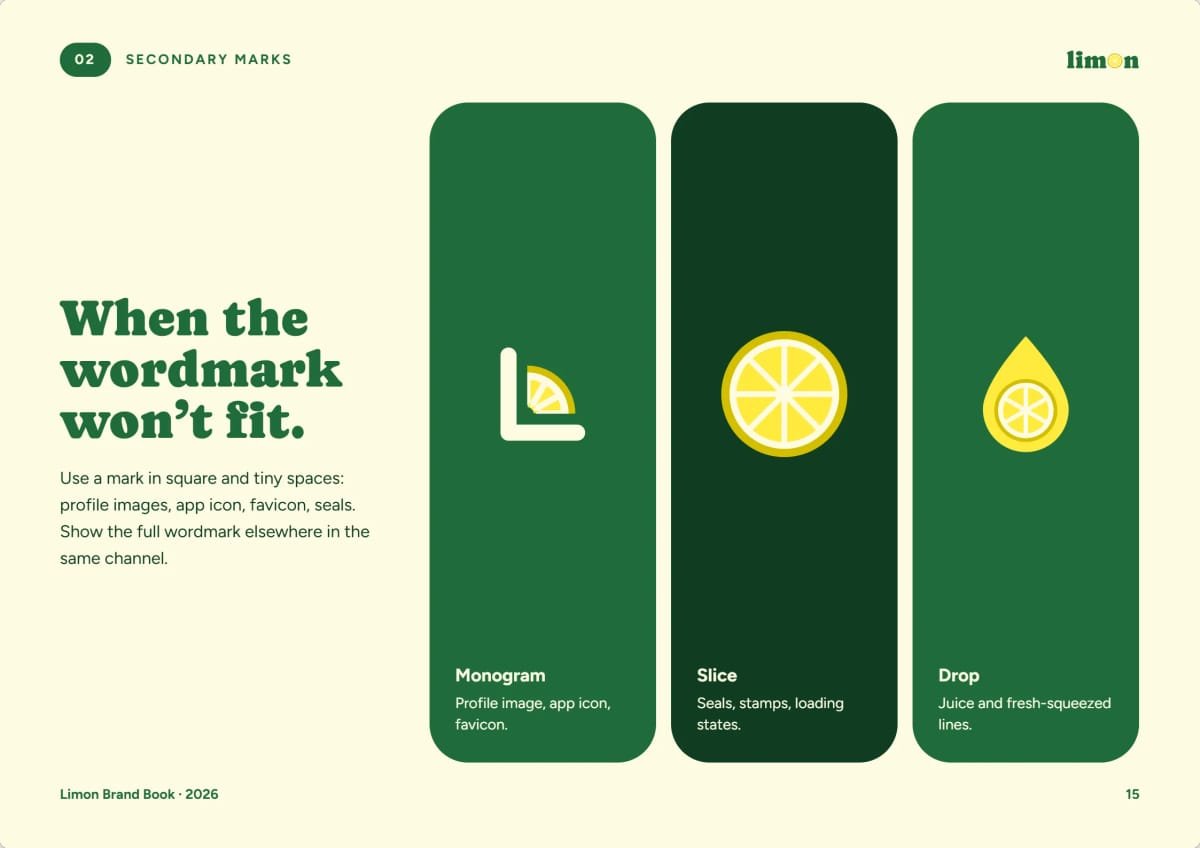
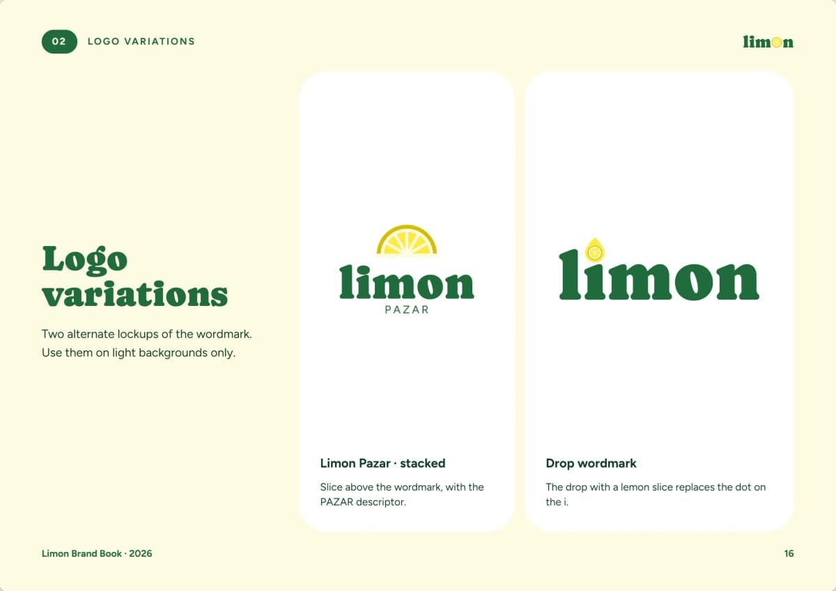
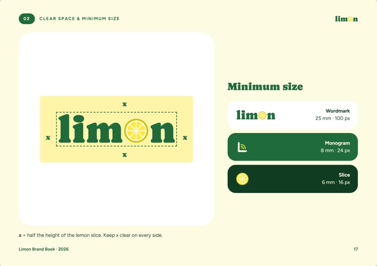
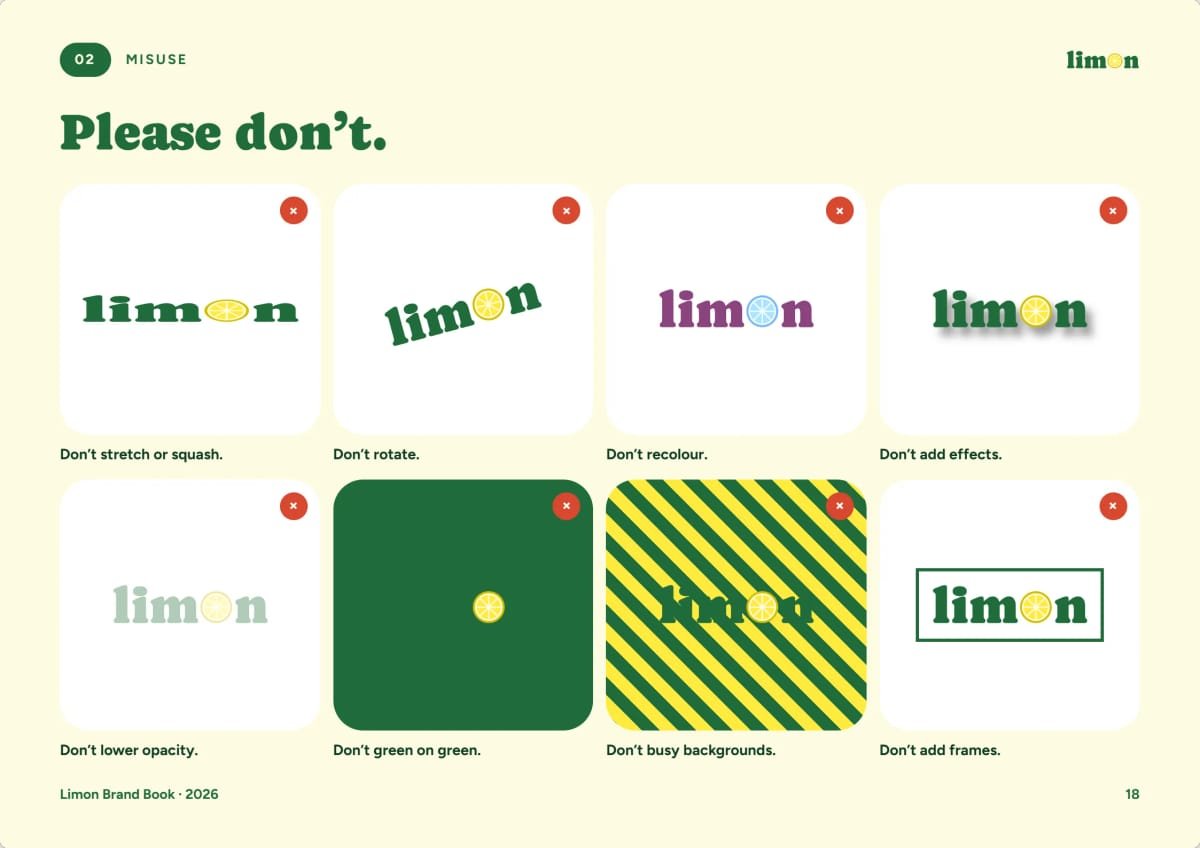
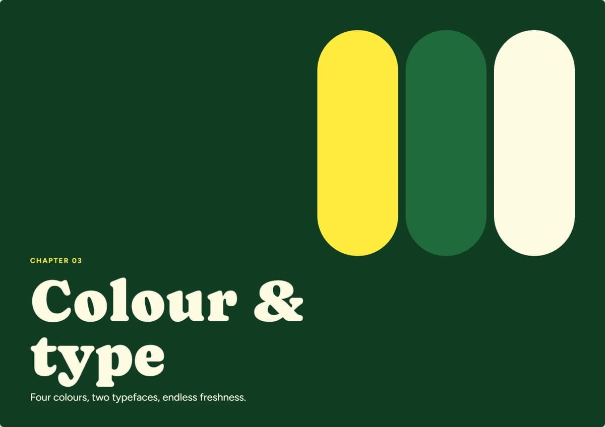
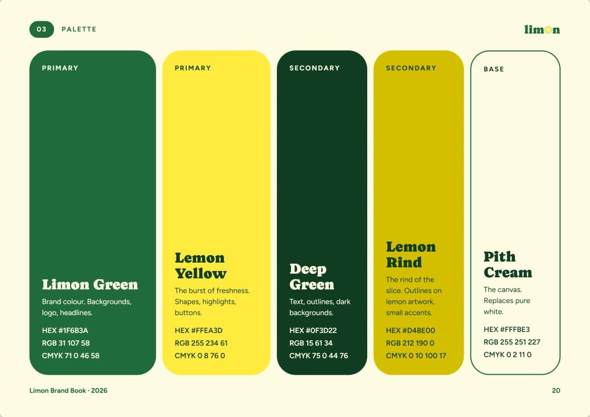
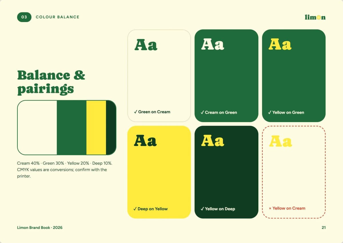
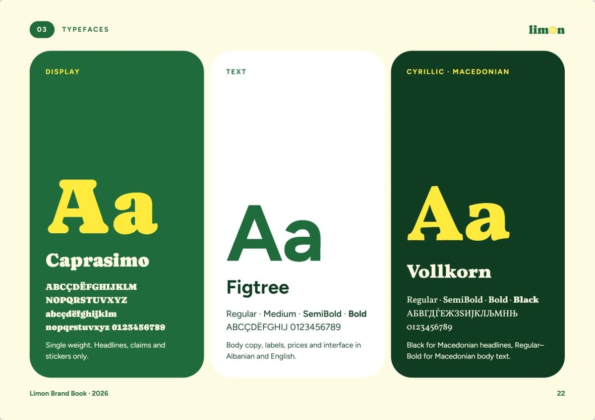
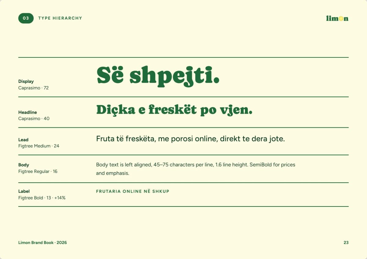
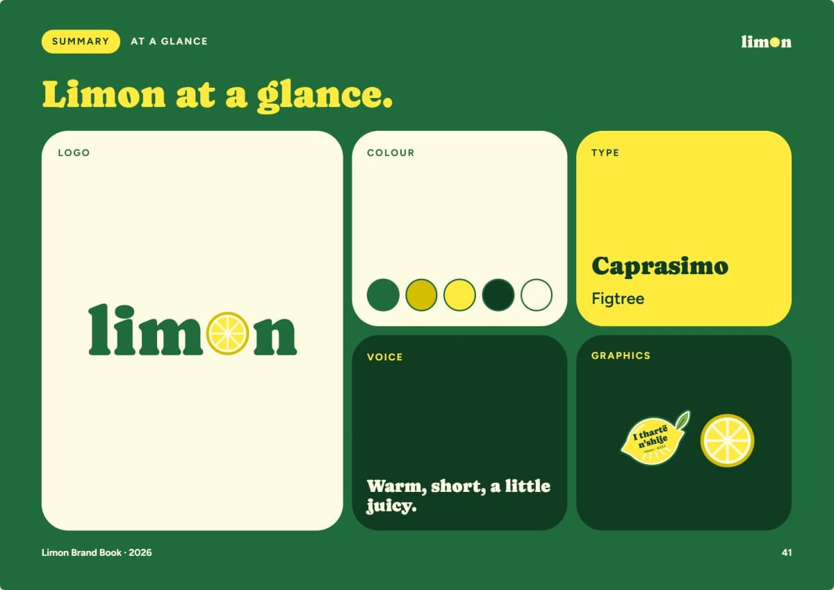
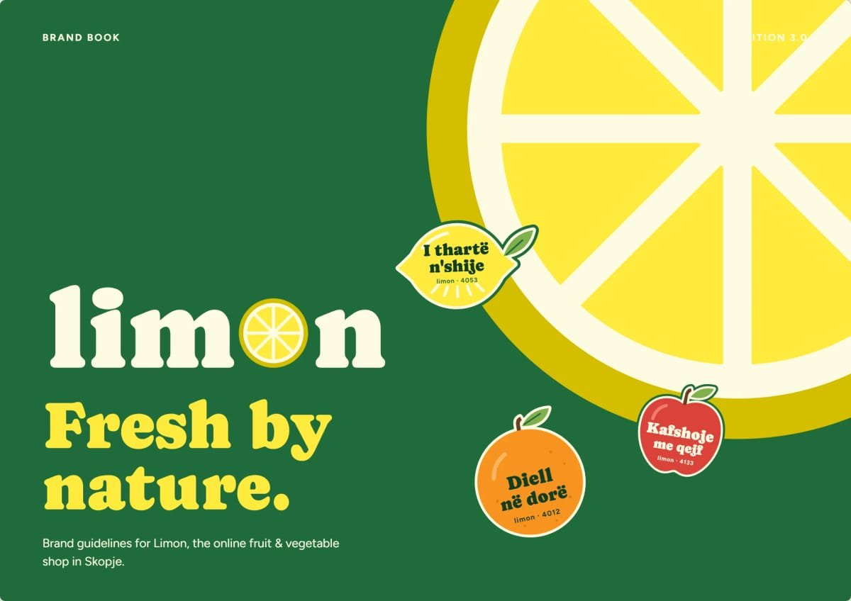
We built the brand around one shape. In the wordmark a lemon slice replaces the O: heavy, rounded lowercase letters that stay friendly and legible from across the street. A monogram, the slice and a juice drop take over where the wordmark won’t fit. Around them sits a sunny palette of Limon Green, Lemon Yellow, Deep Green and Pith Cream, with Caprasimo for headlines, Figtree for text and prices, and Vollkorn for Macedonian in Cyrillic.
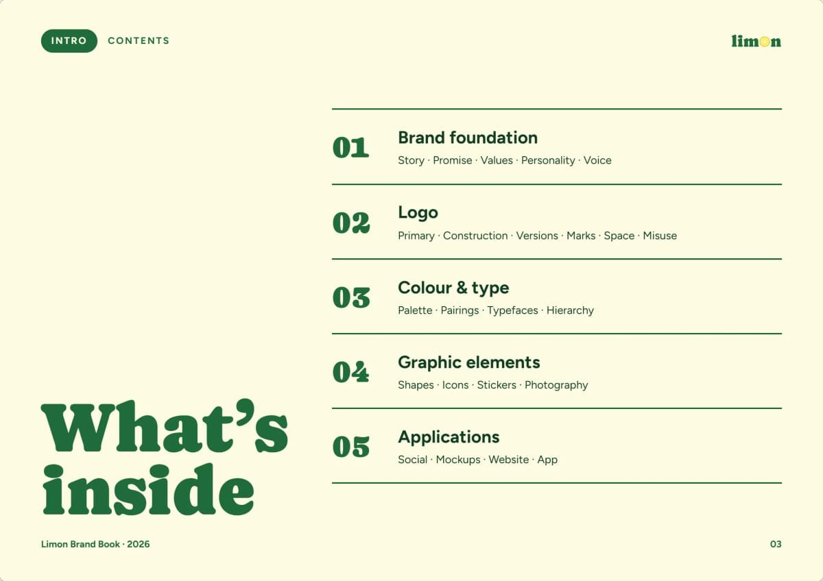
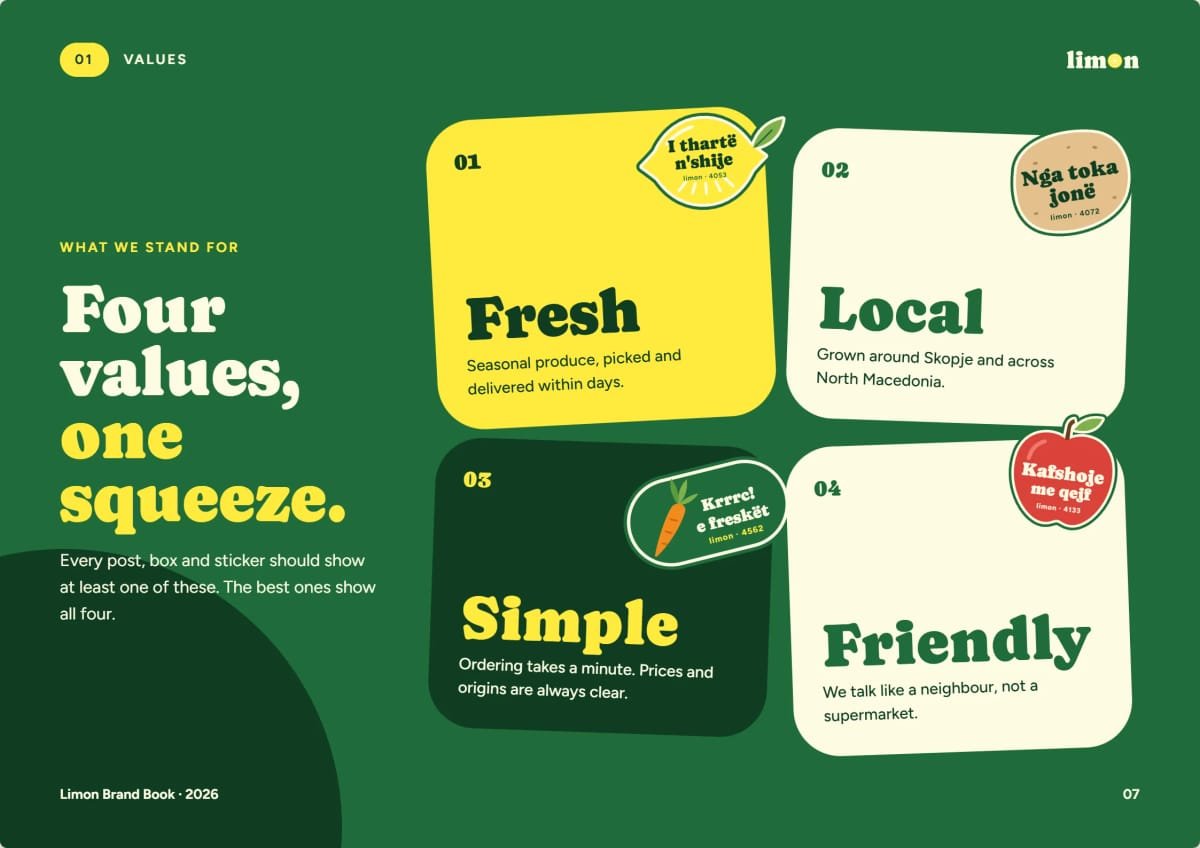
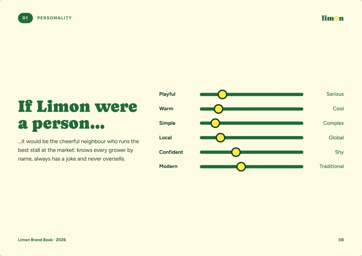
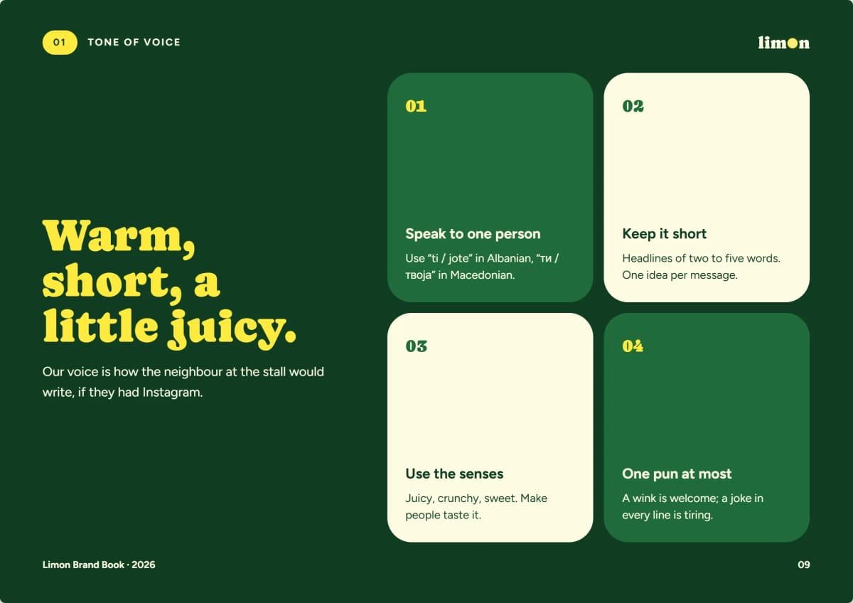
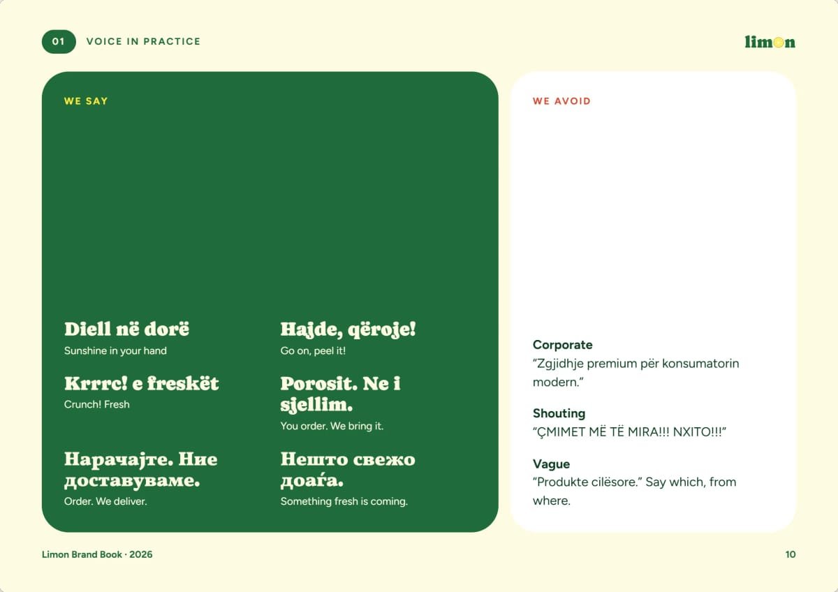
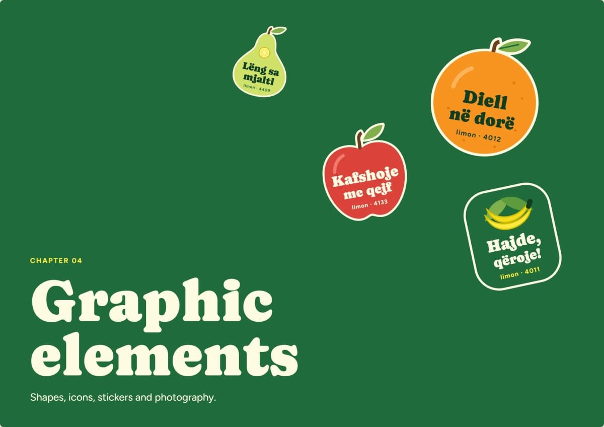
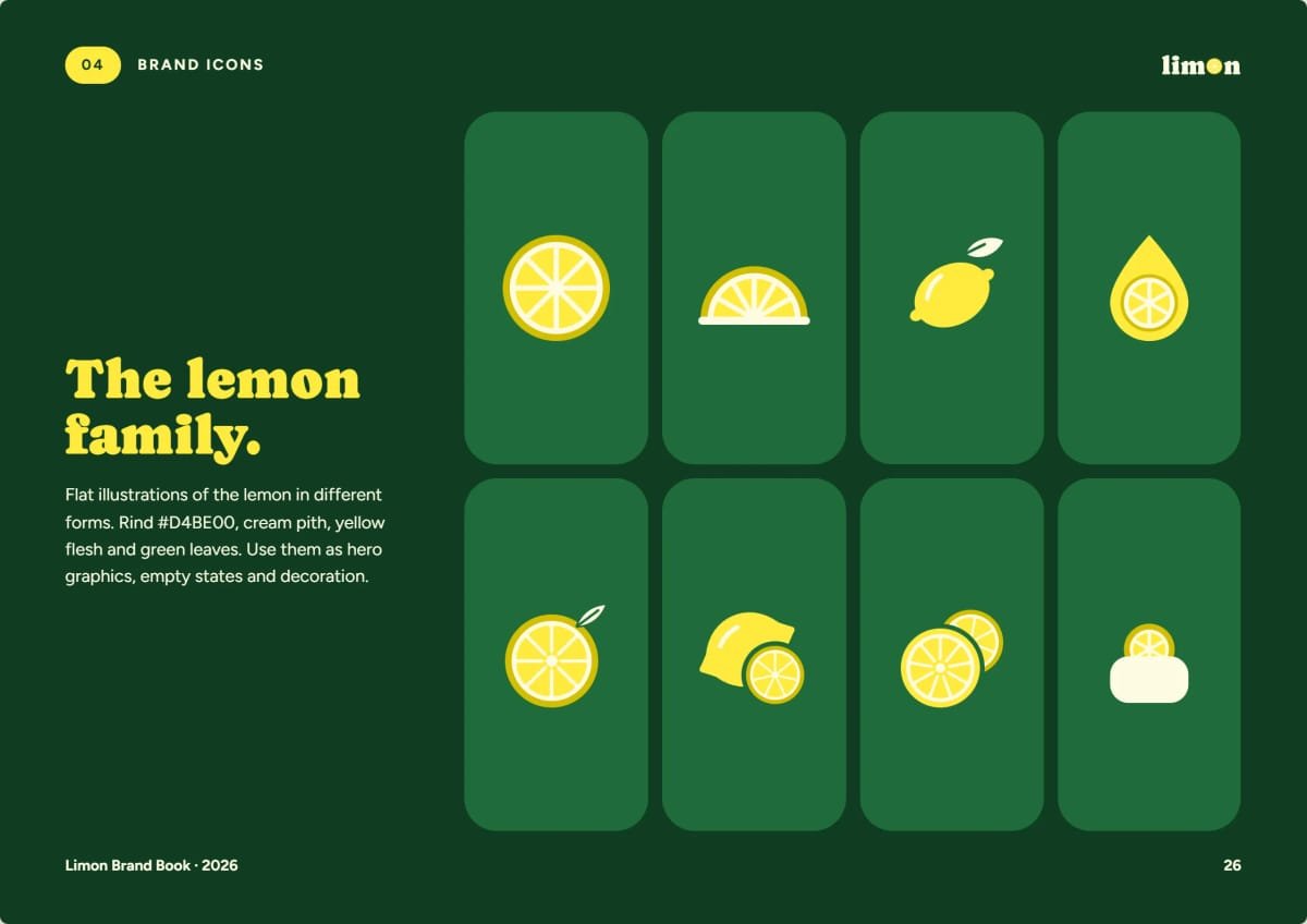
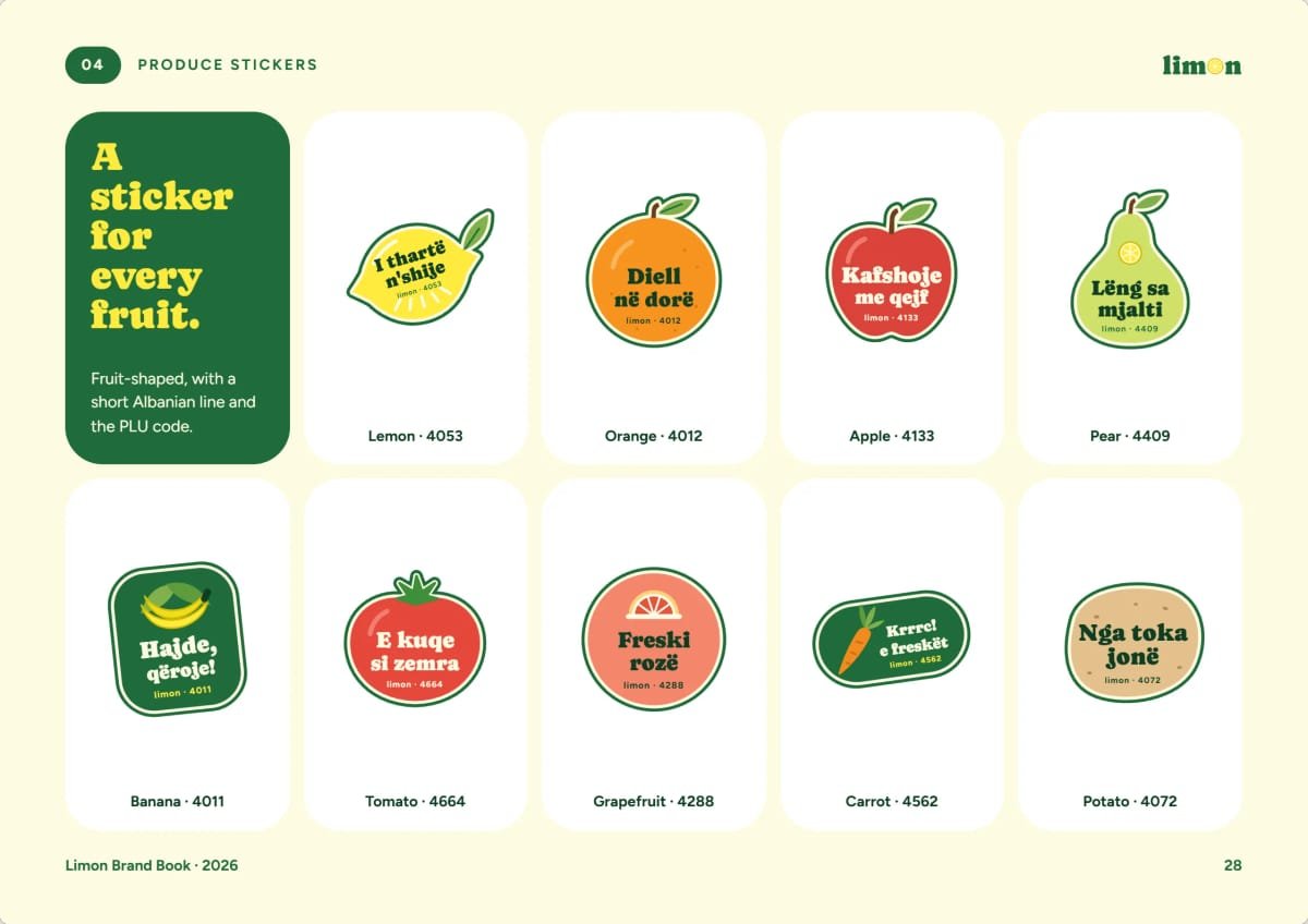
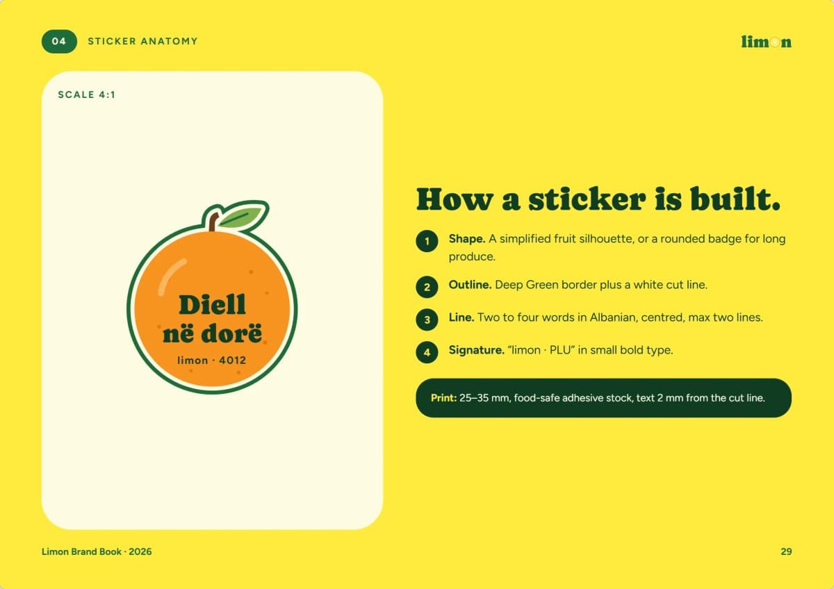
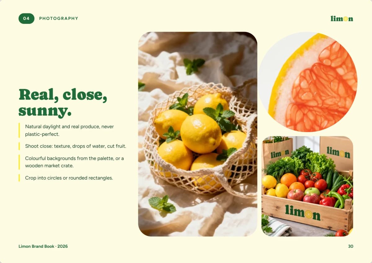
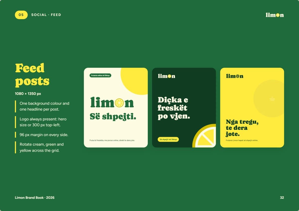
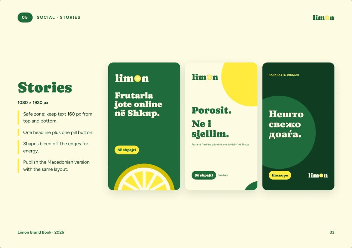
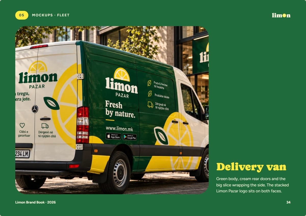
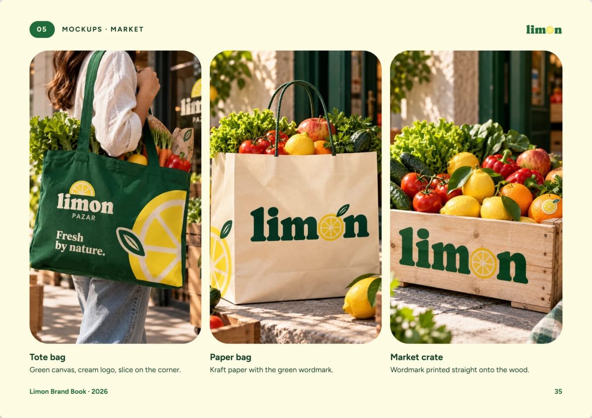
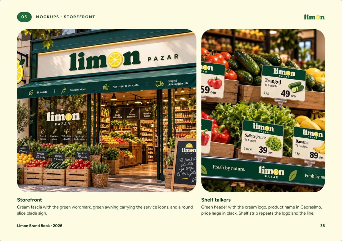
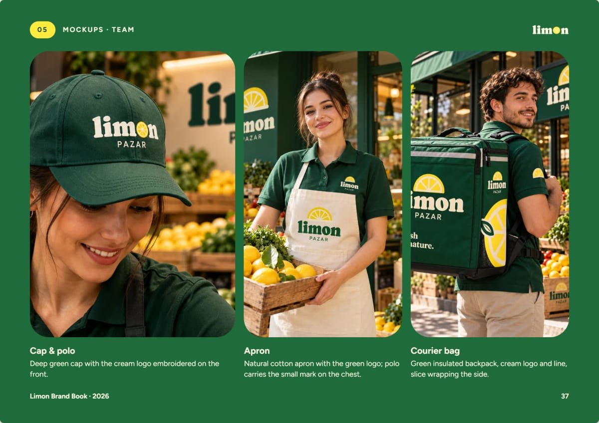
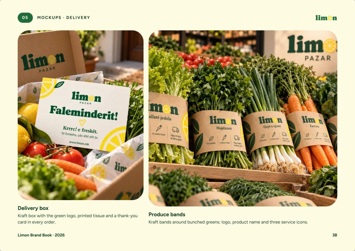
The brandbook sets out the values (fresh, local, simple, friendly), a voice that is warm, short and a little juicy, a family of lemon illustrations and a produce sticker for every fruit, each with a short Albanian line and its PLU code. It then takes the brand into the world: the delivery van, tote and paper bags, market crates, the storefront and shelf talkers, team uniforms, the delivery box and the social media grid.
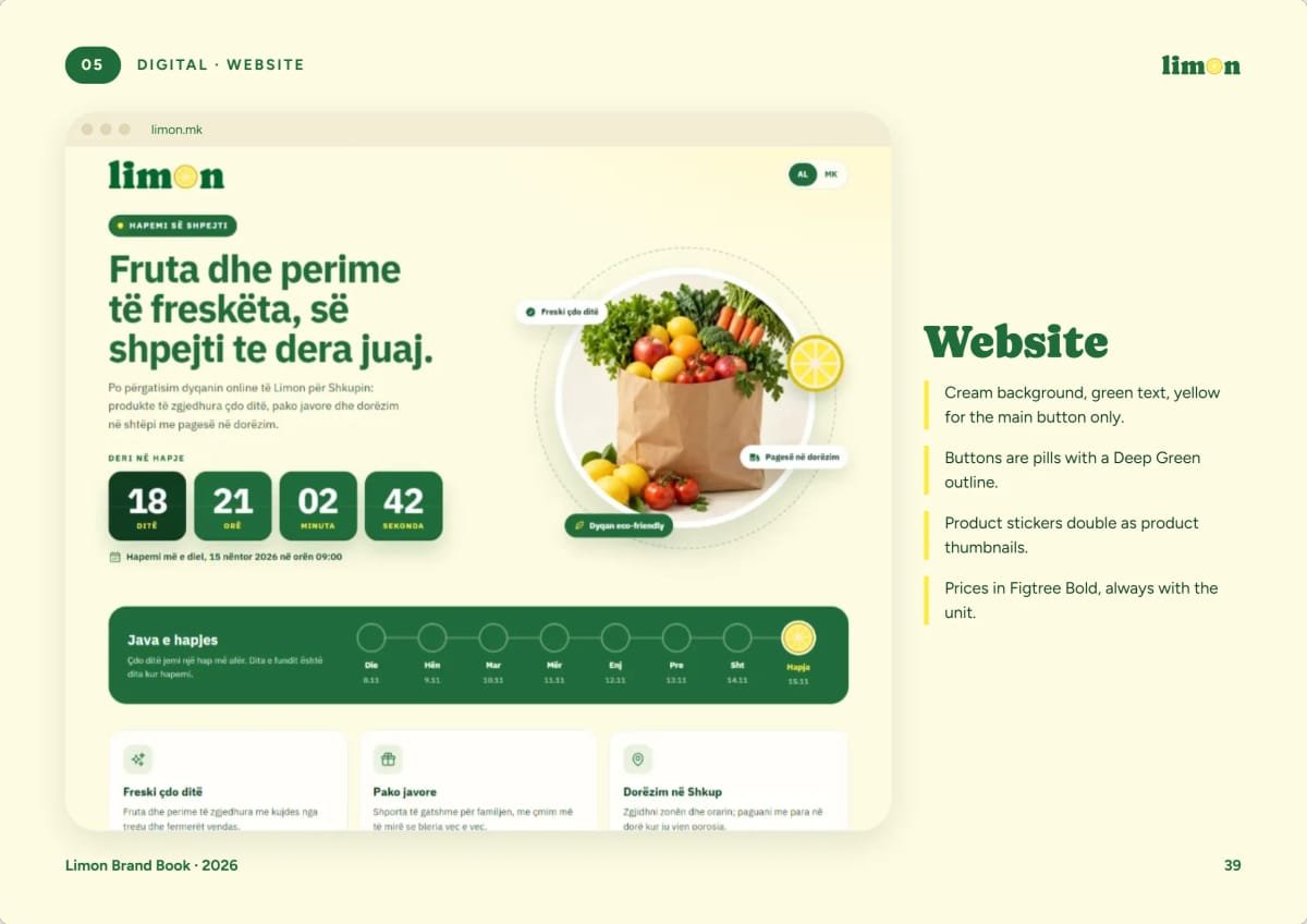
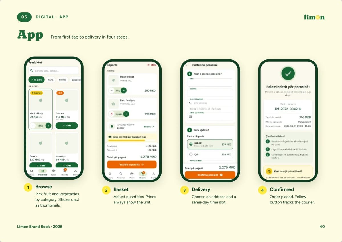
Finally we designed the website at limon.mk and the Android app, from browsing by category to the basket, a same-day delivery slot and the order confirmation.
The result
One bright, recognisable brand, from the sticker on an apple to the van at the door and the app in your hand: fresh by nature.